Build a Portfolio Sector Weight Analyzer in Python

Day 70 of 100 Days Coding Challenge: Python

Yesterday’s mission was neat labels; today’s mission is guardrails. After building a sector classifier, I wired up a real diversification warning that uses my actual holdings. Diversification isn’t a hedge against everything, but it’s a reliable seatbelt against unsystematic risk—the “one company or one industry sneezes, and my portfolio catches a cold” problem. During COVID, anyone parked entirely in hospitality learned this the hard way.

This little alarm is more than a nag; it’s a planning tool. You can use it for sector rotation, thematic tilts, or just sanity checks alongside momentum and RSI. I also like it for quick overlap checks: if a few ETFs secretly pile into the same sector, this makes the crowding visible. Honestly, the feature pays off all the tiny utilities I’ve been adding—now they sing together instead of humming alone.

Today’s Motivation / Challenge

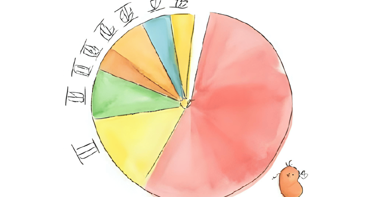
I wanted a single, honest number that says, “Are you concentrated or not?” The challenge: turn tickers into sectors, sectors into dollars, and dollars into weights—without burying the user in math or menus.

Purpose of the Code (Object)

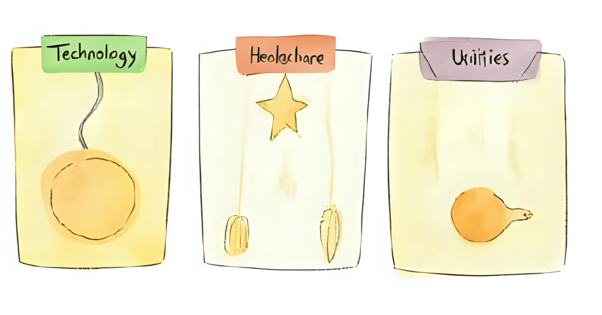
The program reads your tracked tickers and your share counts, fetches current prices, and calculates market value per holding. It then groups by sector (treating multi-sector and bond ETFs as their own diversified buckets) and shows each sector’s weight. If any one slice is larger than your chosen threshold, you get a clear warning.

AI Prompt

“Refactor the diversification function to be small, readable, and robust. Keep inputs flexible, handle ETFs cleanly, and print a concise sector weight table followed by any threshold warnings.”

Functions & Features

  • Record or update shares for each tracked symbol.
  • Classify holdings by sector, with special handling for multi-sector and bond ETFs.
  • Compute sector weights using Market Value = Shares × Price.
  • Trigger a diversification warning if any sector exceeds a threshold (e.g., 35%).

Requirements / Setup

  • Python 3.10+

Install:

pip install yfinance pandas matplotlib

Minimal Code Sample

def sector_weights(rows, threshold=0.35):

    # rows: list of {symbol, sector, shares, price}

    df = pd.DataFrame(rows)

    df[“market_value”] = df[“shares”] * df[“price”]

    total = df[“market_value”].sum()

    if total <= 0:

        return {}, []

    weights = (df.groupby(“sector”)[“market_value”].sum() / total).sort_values(ascending=False)

    offenders = [(s, w) for s, w in weights.items() if w >= threshold]

    return dict(weights), offenders

Compute sector weights from actual dollars; return all weights plus any over the threshold.

Stock Tracker

Notes / Lessons Learned

I initially forgot to store share counts. Which meant every stock was treated like I owned exactly one share—cute for demos, terrible for truth. I was sure I’d written a “set shares” function before; apparently Past Me left Future Me a polite illusion. Once I added a quick way to save shares in stocks.json, the numbers snapped into place.

The joy here is leverage: Python fetches prices, lines up sectors, and crunches totals in seconds. What used to be a spreadsheet slog is now a button press. Also, beware ETF overlap—their tickers look diverse, but their guts sometimes aren’t.

Optional Ideas for Expansion

  • Add “max sector cap” rules per account and print suggested trades to rebalance.
  • Show a tiny trendline of each sector’s weight over time (store daily snapshots).
  • Include an “overlap matrix” for ETFs using their published holdings, if available.

Know Thy Sector Before Thy Portfolio Falls Apart

Day 69 of 100 Days Coding Challenge: Python

Today’s stop on the Stock Tracker Express was “Sector Classification,” and I decided to pull into that station before the Diversification Warning stop. Why? Because you can’t warn about lopsided allocations until you know where your money is hiding. Sector classification is like labeling your pantry—if you find 14 jars of peanut butter and no pasta, you might reconsider your meal plan.

In investing, this helps spot “unsystematic risk,” which is just the fancy way of saying, “If one company or industry tanks, you don’t want your whole portfolio going down with it.” Sometimes, yes, you might choose to overload in one sector—maybe tech is hot or utilities are shining—but the point is to know when you’re doing it. With the sector view in place, you can pair it with performance metrics, macroeconomic signals, or just your gut to make better decisions. My roadmap had diversification before classification, but order matters—this way, we start with a map before we set up roadblocks.

Today’s Motivation / Challenge

If you’ve ever played a board game without reading the rules first, you’ll understand why knowing your sector exposure before diversifying is important. Classification turns a pile of tickers into an organized story, letting you see not just what you own, but where it lives.

Purpose of the Code (Object)


This function takes your tracked tickers, peeks under the hood, and tells you what sector and industry they belong to. For ETFs and funds, it makes an educated guess—flagging them as multi-sector or fixed income when appropriate. The idea is to give you a quick visual of portfolio balance before you go hunting for weak spots.

AI Prompt

Creates the following functions: Fetch sector and industry, identify ETFs and label them as multi-sector or fixed income, and finally print a tidy classification table and sector summary.

Functions & Features

  • Fetch sector and industry data for each tracked stock.
  • Identify ETFs and label them as multi-sector or fixed income.
  • Print a tidy classification table and sector summary.
  • Optionally export results to CSV.

Requirements / Setup

  • Python 3.10+

Install dependencies:

pip install yfinance pandas matplotlib

Minimal Code Sample

import yfinance as yf

def get_sector(symbol):

    info = yf.Ticker(symbol).info

    return info.get(“sector”), info.get(“industry”)

print(get_sector(“MSFT”))  # (‘Technology’, ‘Software—Infrastructure’)

Pulls sector and industry info for a ticker.

Stock Tracker

Notes / Lessons Learned

ETFs can be divas—some announce their sector proudly, others just say “multi-sector” or “bond fund” and walk away. Fixed income ETFs (bond funds) make perfect hedges for my tech-heavy holdings, so I labeled those separately. This classification step also reminded me how ambiguous data can be; without it, I might’ve assumed my ETFs were more focused—or more diversified—than they really are.

Optional Ideas for Expansion

  • Show top three sector weights for ETFs when available.
  • Include historical sector rotation charts.
  • Add filters to display only certain sectors.

Stock Momentum Indicator Made Simple: Compute Trend Direction with Python

Day 68 of 100 Days Coding Challenge: Python

Yesterday’s three-hour duel with RSI left me a little cross-eyed, so I returned today with a reset brain and a mission: add a Stock Momentum Indicator. I’m not a chart whisperer, but this little gauge helps me decide which stocks deserve a spot on the keep list and which ones can politely see themselves out. Of course, no single indicator is a magic “buy/sell” button—RSI and moving averages still earn their keep, and a quick skim of headlines never hurts. If a name like TSLA suddenly lurches up or down, momentum usually lights up first, and that’s my cue to check the news and sanity-check my long-term plan. I’m investing for the marathon, not the sprint; momentum just helps me keep my shoelaces tied.

Today’s Motivation / Challenge

Prices wiggle. Trends matter. The challenge is turning those squiggles into a simple “up, down, or meh” signal you can read in one glance—something practical enough to use with your existing RSI/MA checks without turning your brain into soup.

Purpose of the Code (Object)

The Momentum Score looks at recent closing prices, fits a straight line through them, and tells you if the general direction is up, down, or flat. It also weighs how “clean” the trend is so wobbly lines don’t shout as loudly as steady climbs. You get a single number plus a label that’s easy to act on.

AI Prompt

“Make this function cleaner. Keep inputs/outputs simple, follow PEP 8, handle edge cases (short/NaN data), add concise docstrings, and avoid side effects. Return a small dict with last_close, ann_pct, r2, score, and direction. Prefer readable names over cleverness.”

Functions & Features

  • Momentum Score: Up/Down/Flat with a strength-weighted score.
  • RSI status: Quick read on overbought/oversold.
  • Moving Averages: Short vs. long for context.
  • Fetch recent closes: Pulls the last N days for each ticker.

Requirements / Setup

  • Python 3.10+

Install:

pip install yfinance pandas numpy matplotlib

Minimal Code Sample

def momentum_score(closes, lookback=60):

    s = pd.Series(closes).dropna().astype(float).tail(lookback)

    if len(s) < 20:

        return {“direction”: “flat”, “score”: 0.0, “r2”: 0.0, “ann_pct”: 0.0, “last_close”: float(‘nan’)}

    y = s.values

    x = np.arange(len(y), dtype=float)

    slope, intercept = np.polyfit(x, y, 1)

    y_hat = intercept + slope * x

    ss_res = np.sum((y – y_hat) ** 2)

    ss_tot = np.sum((y – y.mean()) ** 2)

    r2 = 0.0 if ss_tot == 0 else max(0.0, 1.0 – ss_res / ss_tot)

    ann_pct = (slope / np.mean(y)) * 252.0 * 100.0

    score = ann_pct * r2

    direction = “up” if score > 1 else “down” if score < -1 else “flat”

    return {“direction”: direction, “score”: score, “r2”: r2, “ann_pct”: ann_pct, “last_close”: float(s.iloc[-1])}

Fits a straight line through recent prices, scales the slope to annualized %, weights by trend quality (R²), and labels the direction.

Stock Tracker

Notes / Lessons Learned

Yesterday taught me a simple truth: sometimes the best fix is a fresh chat and a tidier workspace. I kept stuffing more context into the same thread and the AI started juggling chainsaws. Uploading the project folder and the roadmap calmed everything down—clean inputs, clean outputs, faster help. People get overwhelmed by messy instructions; AI does too (just less visibly).

Under the hood, momentum is pleasantly un-mystical. Grab the last N closes (I like 60), draw a line, scale the slope to an annualized percentage, weight it by how straight that line is, and call it: up, down, or flat. It runs in seconds, which is delightful—just remember fast ≠ infallible. Spiky data, low volume, or surprise news can throw elbows, so pair this with RSI, moving averages, and a quick look at headlines before you make grown-up decisions.

Optional Ideas for Expansion

  • Add a tiny sparkline plot with the regression line for each ticker.
  • Auto-flag “momentum flips” (e.g., score crosses ±1) and show the last few related headlines.
  • Let each symbol have its own lookback window so slow movers and high fliers get fair treatment.

Stock RSI Made Simple: Calculate Overbought & Oversold Conditions in Python

Day 67 of 100 Days Coding Challenge: Python

Today’s experiment was all about giving my stock tracker a sixth sense—adding the Relative Strength Index (RSI), RSI Stock Indicator . Think of RSI as the mood ring of the trading world: if it reads over 70, your stock might be partying too hard and due for a hangover (price pullback). Under 30? That’s the sulking, underappreciated stock that might be ready to rally.

Now, RSI isn’t the crystal ball some traders wish it was, but it’s a handy companion—especially when paired with the moving average I added yesterday. It’s popular for a reason: it’s simple, visual, and just a little bit addictive. The fun part is seeing it tell a different story than the price chart itself, which feels a bit like watching a behind-the-scenes documentary instead of just the movie.

Today’s Motivation / Challenge

I wanted to give my tracker more “personality” by adding an indicator that can hint when prices might reverse. Also, part of me just wanted to prove to myself that I could wrestle with the math, the formatting, and Yahoo Finance’s occasional mood swings—and win.

Purpose of the Code (Object)

This code calculates the RSI for each stock I’m tracking, then tells me whether each one might be overbought, oversold, or just sitting in the middle lane. It takes the raw price data, does a little statistical gymnastics, and spits out a number that’s easy to read, even if you’ve never taken a finance class.

AI Prompt

Add an RSI tracker to my existing Code

Functions & Features

  • Calculate the 14-day RSI for each tracked stock.
  • Flag stocks as overbought (≥70), oversold (≤30), or neutral.
  • Handle messy or missing data without breaking the whole program.

Requirements / Setup

  • Python 3.x
  • pip install yfinance pandas numpy matplotlib

Minimal Code Sample

def _compute_rsi(series, period=14):

    delta = series.diff()

    gain = delta.clip(lower=0)

    loss = -delta.clip(upper=0)

    avg_gain = gain.ewm(alpha=1/period, adjust=False).mean()

    avg_loss = loss.ewm(alpha=1/period, adjust=False).mean()

    rs = avg_gain / avg_loss

    return 100 – (100 / (1 + rs))  # RSI formula

Calculates the RSI from closing prices using Wilder’s smoothing.

Stock Tracker

Notes / Lessons Learned


If there’s one thing RSI taught me, it’s that the market isn’t the only thing that can get moody—code can too. I ran into a storm of “err arg must be…” errors when pandas didn’t like the format of the data coming from Yahoo Finance. It wasn’t just the low-volume ETFs either; even TSLA decided to throw a tantrum. I tried to fix it, and in the process, managed to break other parts of my program.

After a frustrating 150 minutes of debugging, I threw in the towel and started fresh. One hour later—miracle!—it worked. The fixes? Making value conversions safer, checking Series length before indexing, and printing clear error messages. Then came the “not 1-D” ambush—some tickers return MultiIndex columns, which threw my code into existential crisis. The solution was to always extract a clean 1-D float series before running calculations. Now it runs without cryptic complaints, and I finally feel like I’ve tamed it… for now.

Optional Ideas for Expansion

  • Plot RSI alongside the price chart for a quick visual check.
  • Let the user choose the RSI period length (not just 14 days).
  • Add alerts for when a stock crosses the overbought/oversold thresholds.

The Long and Short of It: Moving Averages for Lazy Traders

Day 66 of 100 Days Coding Challenge: Python

I’ve added a new trick to my stock tracker: the moving average. Think of it as the “Zen master” of stock analysis—calm, collected, and uninterested in daily drama. I set it up so I can see both the short-term (7-day) moving average, which catches the mood swings, and the long-term (30-day) moving average, which reveals the bigger picture. Short-term trends tell you if a stock is suddenly sprinting, while long-term averages show if it’s been strolling uphill—or slowly rolling downhill—over time.

In finance, we do this on all sorts of timelines: monthly, quarterly, yearly. I’m not a day trader, so this isn’t about chasing every market twitch. Instead, this helps me filter out noise and focus on the broader trend—much like ignoring the gossip at the office and paying attention to the quarterly earnings report. In the future, I’d like to use this to spot “support” and “resistance” levels—that is, the invisible floor and ceiling where prices tend to bounce.

Today’s Motivation / Challenge

Daily stock prices are a roller coaster. Fun if you like screaming every 3 seconds, exhausting if you actually want to get somewhere. Moving averages smooth out the ride, letting you see if the track is going up, down, or looping sideways.

Purpose of the Code (Object)

This feature takes the recent stock prices for each symbol, calculates the 7-day and 30-day averages, and compares them to the most recent closing price. The result: a quick glance at short-term momentum versus long-term direction, without getting blinded by daily price noise.

AI Prompt

“Add a function to track the 7-day and 30-day moving averages of listed stocks, comparing each to the last closing price, and display the results clearly.”

Functions & Features

  • Calculates 7-day and 30-day simple moving averages (SMA).
  • Compares latest price to SMA values.
  • Displays trends for quick decision-making.

Requirements / Setup

pip install yfinance pandas

Minimal Code Sample

closes = hist[‘Close’]

last = float(closes.iloc[-1])  # Get most recent closing price

sma7 = closes.rolling(window=7).mean().iloc[-1]

sma30 = closes.rolling(window=30).mean().iloc[-1]

Calculates the last closing price and both moving averages.

Stock Tracker

Notes / Lessons Learned

The first time I ran this, Pandas wagged its finger at me with a “FutureWarning” about float(series). Apparently, in Pandas 2.2+, turning a whole Series into a single float is too vague. Imagine handing a librarian a 300-page book and saying, “Turn this into a number.” Which page, line, or word? Pandas now demands you be explicit:

  • .iloc[0] → picks the first element.
  • .item() → converts it directly to a Python number.

Once I cleaned up the code and restarted, it ran like a charm. And honestly, seeing my own program spit out these averages feels much better than refreshing some finance site.

Optional Ideas for Expansion

  • Add a chart to visualize SMA crossovers.
  • Let the user set custom time windows for moving averages.
  • Include alerts when the short-term average crosses the long-term average.

When the Stock Rings, I’ll Answer

Day 65 of the 100 Days Coding Challenge: Python

Today’s project was all about giving my stock tracker a voice—or at least the Python equivalent of tapping me on the shoulder. I added a suite of functions to build a simple price alert system. Now, I can set an alert for any stock symbol, pick a target price (whether I expect it to go soaring or take a nosedive), and check those alerts whenever I feel like it. The alerts live in alerts.json, which means they survive beyond the current run of the program, unlike my patience for earnings season.

Given the market’s recent mood swings—some days it’s caffeine-powered optimism, other days it’s “time to move into a cabin in the woods”—this feature feels like a smart way to keep tabs on a few key stocks. I also tossed in the ability to list all active alerts and remove them once they’re no longer relevant.

I’m not a day trader, so I won’t be glued to this alert system like it’s the final episode of a drama series. But I’m already thinking about how this little foundation could be built into something bigger—perhaps even a full-blown, automated “call me when it matters” system.

Today’s Motivation / Challenge

Sometimes you don’t want to watch the market all day—you just want it to tap you politely when something interesting happens. This project scratches that itch. It’s like hiring a butler who only bothers you when your investments hit the numbers you care about.

Purpose of the Code (Object)

The code lets you set stock price alerts for any symbol, save them, and check them against live prices. You can remove old alerts, list current ones, and trust they’ll be there the next time you run the program. It’s a neat way to track specific opportunities without manually refreshing a stock chart every five minutes.

AI Prompt

Please add a Price Alert system. Let the user set a target price and alert if the current price crosses it. The system needs the following functions: set a price alert, check price alerts now, list alerts, and remove an alert.

Functions & Features

  • Set a Price Alert – Choose a stock, pick a price, and decide if you want to be notified when it rises above or falls below that level.
  • Check Alerts – Compare live prices against saved alerts.
  • List Alerts – See what you’re tracking at a glance.
  • Remove Alerts – Delete alerts you no longer need.

Requirements / Setup

pip install yfinance

Python 3.8+ recommended.

Minimal Code Sample

def check_price_alerts():

    alerts = load_alerts()

    for alert in alerts:

        price = get_price(alert[“symbol”])

        if (alert[“type”] == “above” and price > alert[“target”]) or \

           (alert[“type”] == “below” and price < alert[“target”]):

            print(f”ALERT: {alert[‘symbol’]} hit {price:.2f}”)

Checks each saved alert and prints a message if the condition is met.

Stock Tracker

Notes / Lessons Learned

Yes, I was a bit tired today, so when I created my shiny new alerts.json file, I somehow misspelled it. Naturally, the program refused to recognize it. That was my first mistake. The second? Entering an alert incorrectly—forgetting to choose “above” or “below” before typing in the target price. This left the file corrupted and the program more confused than I was during my first economics class.

The fix was simple but satisfying: I added a load_alerts() function that returns [] if the file is empty and quietly backs up a corrupt JSON before starting fresh. I also made save_alerts() write to a temporary file first, then replace the original in one move. No more half-written files, no more unexpected crashes.

The real lesson? Creating new errors isn’t a bad thing—it’s a great way to see where the cracks are before the whole thing falls apart. It’s a bit like stress-testing your code, except the stress is mostly on you.

Optional Ideas for Expansion

  • Add email or SMS notifications when an alert triggers.
  • Integrate with a dashboard to show alert history.
  • Let alerts expire after a set number of days.

I Made A Visualizing Stock Volatility Tool in Python

Day 64 of 100 Days Coding Challenge: Python

For the last few days, I’ve been steadily upgrading my stock tracker with little nuggets of market intelligence—kind of like giving a hamster a GPS and a Fitbit. Today’s upgrade: a Volatility Checker, which ranks your stocks by how wildly they’ve been swinging around lately.

One detail worth noting is the setting auto_adjust=False. Normally, when you download stock prices, finance APIs like to quietly “fix” the numbers for dividends and stock splits. Nice in theory, but I wanted raw, unpolished numbers—like getting your coffee without sugar or cream—so that my results match every other function in my program and avoid those overly polite warning messages.

I also baked in the formula: annualized volatility = daily_std * sqrt(252). Here, daily_std is the standard deviation of daily returns—basically, how jittery a stock has been day-to-day. Multiplying by the square root of 252 assumes there are about 252 trading days in a year. It’s like saying, “If this stock keeps bouncing around at the same pace all year, here’s how dramatic it will look.”

But, markets don’t always stick to 252 trading days. So I went a step further—adding a flag that lets the program annualize based on the actual number of trading days in my dataset. It’s like tailoring a suit instead of buying it off the rack—more accurate and much better fitting.

Today’s Motivation / Challenge

Some investors watch price charts like hawks. Others, like me, enjoy knowing which stocks are acting like calm lakes and which ones are more like caffeinated squirrels. By ranking volatility, you can spot potential opportunities—or avoid heartburn—before making your next move.

Purpose of the Code (Object)

This function checks recent price swings for your tracked stocks, calculates how volatile they’ve been, and ranks them from wildest to tamest. It works for short windows like 10 days or longer periods like 90, depending on how much market drama you want to see. The output includes both daily volatility and an annualized version.

AI Prompt

Please add the following function to the script. “Volatility Checker: Calculate and rank stocks by recent price volatility.”

Functions & Features

  • Tracks and ranks stocks by recent volatility
  • Calculates both daily and annualized volatility
  • Works with a user-selected date range
  • Optionally annualizes based on actual trading days in your dataset

Requirements / Setup

pip install yfinance

pip install matplotlib

pip install pandas

Python 3.9+ recommended.

Minimal Code Sample

returns = closes.pct_change().dropna()

daily_vol = returns.std()

annual_vol = daily_vol * math.sqrt(len(closes))  # based on actual days

Calculates daily volatility, then annualizes it based on your dataset length.

Stock Tracker

Notes / Lessons Learned

Finance isn’t new to me—I’ve studied it and used it in real life—but coding it is a different story. You can know the theory (like “252 trading days in a year”) without realizing the programming implications until you see the raw code. AI acts like the friend who not only reminds you of the theory but also shows you how to plug it into your function, keeping you from stepping into common traps.

By now—day 64—I’m convinced that AI’s real power isn’t just spitting out answers; it’s stitching together knowledge from different worlds and handing you a well-fitted solution. Still, the joy comes from building something from scratch. With AI as your co-pilot, you’re suddenly flying first class.

Optional Ideas for Expansion

  • Allow filtering for “Top 5 most volatile stocks” only
  • Save volatility rankings to a CSV for record-keeping
  • Add color-coded output for quick scanning (green for calm, red for wild)

Track Portfolio Growth Simulation with Python and yfinance

Day 63 of 100 Days Coding Challenge: Python

On a quiet Saturday morning, armed with coffee and optimism, I dove into today’s coding task: building a function that calculates what my portfolio would be worth today if I had invested a certain amount X days ago. In my Excel days, I used to do this sort of thing manually—lots of formulas, lots of scrolling, and the occasional formatting meltdown. But coding it? That felt far more satisfying, like turning a laborious chore into a sleek push-button tool.

In the real investing world, this is a performance measurement exercise: “How much did this lump sum grow or shrink over that period?” It’s also a sobering way to check whether your portfolio is keeping pace with the S&P 500 or whatever benchmark you care about. One moment you’re patting yourself on the back, the next you’re wondering if you should have just bought an index fund and taken the afternoon off.

It’s also fantastic for “what if” scenarios: missed opportunities, potential sector shifts, or just feeding your curiosity. “If I’d put $10,000 into Tesla six months ago, it’d be worth $14,000 today—a 40% gain. How does that compare to the Nasdaq?” You can test those ideas instantly. Today’s code felt like a solid investment itself—an investment in my ability to measure investments.

Today’s Motivation / Challenge


Being able to quickly test “what if” scenarios helps me make more informed choices. Whether it’s checking how a holding performed, comparing it to a benchmark, or seeing how badly I missed the boat on a hot stock, this feature brings insight without the spreadsheet headaches.

Purpose of the Code (Object)


The function takes a starting investment amount and a time frame, then calculates how much that investment—split equally among all tracked stocks—would be worth today. It uses historical price data to find the purchase price and today’s value, so you can see gains, losses, and percentage changes without doing the math yourself.

AI Prompt: 

Create a Python function that simulates the value of an equal-weighted investment across multiple stocks from X days ago to today, using yfinance historical data.

Functions & Features

  • Calculate equal-weight portfolio growth over a set number of days
  • Show per-stock performance in dollars and percentage terms
  • Handle missing or invalid price data gracefully
  • Display total portfolio gain/loss and percentage change

Requirements / Setup

pip install yfinance pandas matplotlib

Python 3.8+ recommended.

Minimal Code Sample

idx = closes.index.searchsorted(pd.Timestamp(target_date))

first_close = closes.iloc[idx]

last_close = closes.iloc[-1]

Selects the first available close on/after the target date and the last available close—no ambiguous Series logic.

Stock Tracker

Notes / Lessons Learned


When I first ran the code, it hit me with two issues. The first was a friendly FutureWarning:

FutureWarning: YF.download() has changed argument auto_adjust default to True

This is Python’s polite way of saying, “Hey, our defaults changed. You might want to set auto_adjust yourself so you know what you’re getting.” Easy fix: add auto_adjust=False (or True if you prefer adjusted prices) to every yf.download(…) call.

The second was less polite:

The truth value of a Series is ambiguous.

I had code like:

if hist[‘Close’][hist.index >= target_date]:

That hist[‘Close’][…] returns a Pandas Series—a list of prices. Python doesn’t know whether I mean “Is this empty?” or “Are all of these True?” or “Is at least one True?” So it refuses to guess. The fix was to pick a single value with .iloc[0] or check .empty.

My final mistake? Forgetting to restart my Python session after fixing the code. I kept seeing the same error because Python was still running the old function from memory. Lesson learned: restart your environment after major changes, or you’ll be debugging ghosts.

Honestly, I’m glad I chased this bug down—it’s one of those errors I won’t forget, and it’s a reminder that both my code and my process are worth investing in.

Optional Ideas for Expansion

  • Add weighted allocation for “X days ago” simulations
  • Compare portfolio performance to a benchmark like the S&P 500
  • Save simulation results to a CSV for record-keeping

The Stock Market Mood Ring

Day 62 of 100 Days Coding Challenge: Python

Yesterday, I taught my script how to look into the past—specifically, the last 30 days of each tracked stock’s closing prices. Today, we’re talking emotions—well, stock emotions. I added a function in Python to show each stock’s daily percentage change, color-coded like a moody person: green when it’s up, red when it’s down, and default when it’s flat.

Now, to be clear, I’m not a day trader glued to five monitors with live tickers whizzing by. I have a full-time job, thank you very much, and no one’s got time for that kind of circus. I check in weekly, adjust when needed, and focus on consistency over drama. Still, this function gives me a quick visual snapshot of how things are moving—and more importantly, how they might move. It’s like giving your portfolio a morning coffee and asking, “How are we feeling today?”

Patterns are the name of the game. If I can start spotting them, maybe one day I’ll teach this program to make some educated guesses—and eventually, add a bit of risk management to keep me from playing financial roulette. The next few days are all about adding the kind of analytical firepower that helps with smarter decisions down the road. And honestly? I’m kind of pumped.

Today’s Motivation / Challenge

You know that moment when you look at your bank account and squint, wondering, “What happened yesterday?” That’s what this feature is for. It’s like a digital mood chart for your stocks—without the therapy bills. Adding daily change percentages, especially in color, helps me scan for drama or calm in seconds. It’s a tiny step toward building a truly useful tool for hands-off investors like me, who want the intel without the stress.

Purpose of the Code (Object)

This code adds a quick visual check-in for each stock in my portfolio. It tells me whether a stock’s price went up or down today—and by how much—without needing a spreadsheet or third-party app. It’s lightweight, readable, and tailored to my investment rhythm.

AI Prompt (used to create today’s function):

“Please add the following function to the script.
Daily Change (%): Show today’s % change for each stock with green/red highlight.

Functions & Features

  • Calculates daily percent change for each stock.
  • Highlights gains in green and losses in red.
  • Leaves unchanged stocks in default color.
  • Makes my console look like it actually cares.

Requirements / Setup

pip install yfinance

Minimal Code Sample

if change_percent > 0:

    color = “\033[92m”  # Green

elif change_percent < 0:

    color = “\033[91m”  # Red

else:

    color = “\033[0m”   # Reset

This assigns a text color based on the day’s percent change in stock price.

Stock Tracker

Notes / Lessons Learned


I’m starting to feel like a feature-adding machine—well-oiled, slightly caffeinated, and surprisingly organized. Thanks to the roadmap I drafted early on, it’s easier to stack new functions like LEGO bricks (minus the foot pain).

Today, I learned how to add color using ANSI escape codes. Think of them as secret signals you whisper to your terminal to make it look fancier. So now, green means the stock had a good day, red means it might need a hug, and the reset command keeps the rest of the terminal from turning into Christmas.

What I love about this feature? It’s subtle but powerful. Visual clarity goes a long way when you don’t have time to deep dive. And hey—who knew the terminal had a flair for drama?

Optional Ideas for Expansion

  • Add arrows (↑/↓) next to the percent for more flair.
  • Let users set custom alert colors (purple for panic? Why not).
  • Create a summary line showing how many stocks gained vs. lost today.

Watching Your Stocks Like a Hawk (But With a Graph)

Day 61 of 100 Days Coding Challenge: Python

The last five days were all about laying the foundation—think of it as assembling IKEA furniture, but with Python and fewer Allen wrenches. I got the stock tracker’s bones in place, installing essentials like the yfinance library. Now, it’s time to dress it up and make it do something more alive—like track real stock movement over time.

I’m finally stepping into the exciting part: creating a portfolio visualization that doesn’t require squinting at 14 browser tabs.

We’re starting simple. One historical price chart per stock. No more, no less. Why? Because trying to cram five charts into one screen is like watching five soap operas at once—dramatic, confusing, and probably bad for your blood pressure.

Back in university, my finance professors swore by stock observation like it was a sacred rite. Watch the markets, they said. Understand the impact of events—unemployment numbers, interest rate announcements, or when Jerome Powell so much as blinks. These things shake the market, and now, thanks to a bit of Python magic, I can watch those ripples without hopping from one website to another.

Today’s Motivation / Challenge

Have you ever tried checking your stocks manually, one by one? It’s like chasing toddlers in different directions. Today’s goal: automate that madness. With a single function, I want to see the historical price trends of each stock in my portfolio—visually. Because numbers are fine, but a chart? A chart speaks volumes.

Purpose of the Code (Object)

This little script fetches and plots the past 30 days of closing prices for each stock in your portfolio. It doesn’t try to impress anyone with fancy calculations. It just shows you what your stock has been up to, in a nice, simple line graph—so you can stop opening 27 browser tabs.

AI Prompt

Add the function to plot past 30-day price history for a single stock

Functions & Features

  • Plots past 30-day price history for a single stock
  • Automatically fetches historical data from Yahoo Finance.
  • Easy to reuse for each stock in your portfolio

Requirements / Setup

pip install yfinance matplotlib

Minimal Code Sample

import yfinance as yf

import matplotlib.pyplot as plt

def plot_stock_history(ticker):

    stock = yf.Ticker(ticker)

    hist = stock.history(period=”30d”)

    hist[‘Close’].plot(title=f”{ticker} – Last 30 Days”)

    plt.xlabel(“Date”)

    plt.ylabel(“Price ($)”)

    plt.grid(True)

    plt.show()

→ Fetches and plots 30-day closing price for a given stock symbol.

Stock Tracker

Notes / Lessons Learned

To get this feature working, I first installed yfinance and matplotlib. Easy enough—until I noticed the pip version nagging me to update (again). I was on 25.1.1, and suddenly it wants 25.2. It’s like that one friend who insists on “just one more update” before going out.

This is the reality of programming: libraries get updated more often than your favorite streaming shows, and if you’re not careful, your working code might just throw a tantrum the next day. I used to roll my eyes when game servers went down for “maintenance.” Now I know—those devs were heroes.

Also, pro tip: stock movements don’t just come from earnings reports. Tariff announcements? Those hit hard. I saw a few of my stocks tumble right after one went into effect. Should’ve bought the dip… but hey, now I can at least see it happening, in style.

Optional Ideas for Expansion

  • Add a dropdown menu or an input box to select stock instead of typing it
  • Color-code gains vs losses on the chart
  • Combine charts into one interactive dashboard (when you’re feeling brave)