Day 44 of 100 Days Muscle Resistance Workout Challenge
Focus Topic: Recognize how even a 2–5 percent Rule can drive strength and endurance gains over time.
Learning Material
Progress in fitness is often mistaken for dramatic transformations, big weight jumps, visible muscle changes, or personal records. But in truth, real progress hides in small, consistent improvements. Adding just a little more, whether weight, reps, or time, creates powerful long-term results because your body responds to gradual adaptation, not drastic shocks.
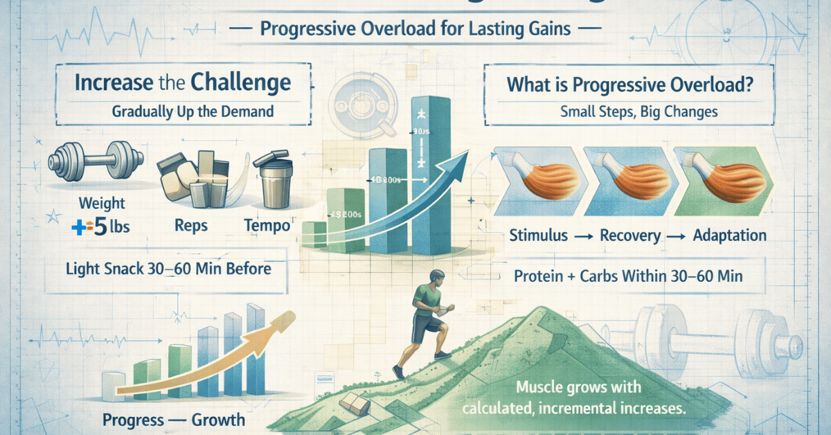
This idea lies at the heart of the Kaizen principle, continuous, small improvements over time lead to massive change. In training, this is the foundation of progressive overload, the slow and deliberate process of making each workout just slightly more challenging than the last.
Key Insights
1. The Power of the 2–5% strength progression
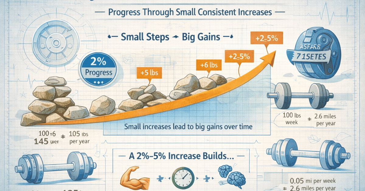
A 2–5% increase in training load, whether it’s weight, distance, or duration, might seem insignificant at first. But that’s the magic of compounding effort. Small increases allow your body to adapt safely while building long-term strength and endurance.
For example:
- If you squat 100 pounds, adding just 2 pounds a week becomes over 100 pounds added per year.
- If you walk or run 1 mile and increase by 0.05 miles per week, you’ll cover an extra 2.5 miles per month.
Over time, these micro-adjustments add up to enormous change, without burnout or injury.
Key Insight 1: Consistency compounds. Your body rewards repetition and small progress more than it does intensity without continuity.
2. The Science Behind Gradual Gains
Studies show that small, steady increases in resistance trigger muscle adaptation more effectively than irregular, high-intensity spikes. Gradual overload enhances neuromuscular efficiency, meaning your brain and muscles learn to coordinate better over time.
Your muscle fibers strengthen in response to the new challenge, and your nervous system becomes more efficient at activating them. The result?
You become stronger without feeling overwhelmed.
A study published in Frontiers in Physiology (2019) found that participants who followed a linear progression model—adding small increments each week—achieved greater strength gains and fewer injuries compared to those who trained with inconsistent intensity1.
Key Insight 2: Growth isn’t just muscular, it’s neurological. Your brain learns efficiency before your body shows a visible change.
3. Real-World Example: The Piano Principle
Think of strength training like learning to play the piano. You don’t start with a concert piece; you start with scales, improving a little each day. At first, progress feels slow. But a month later, what once felt difficult becomes second nature.
Muscle training works the same way. Each repetition fine-tunes the “coordination” between your mind and body. Eventually, your movements become smoother, your balance improves, and your endurance increases, all from those small, consistent efforts.
Key Insight 3: Small improvements turn into automatic strength, just as daily practice creates mastery in any skill.
4. The Psychology of Small Wins
Tiny victories trigger dopamine, the brain’s “reward” chemical, which keeps motivation alive. When you notice even a 1-rep or 2-pound increase, your brain records it as success, encouraging you to repeat the behavior.
Psychologists call this the “Success Spiral,” a positive feedback loop where progress builds momentum. Over time, these micro-wins become habits that feel almost effortless.
Metaphor: Small steps are like drops of water. One drop seems trivial, but over time, they carve stone.
My Reflection
As someone who plays the piano, I understand the idea of slow, invisible progress very well. Improving piano skills takes time, patience, and consistency, and the results are often subtle. Many people quit halfway through the process because they can’t see their improvement. But mastery, whether in music or fitness, comes quietly, through small, persistent steps.
When I began my Kaizen project, I reminded myself that every bit of progress matters, even if it’s not linear. Sometimes, we even take a step backward. In piano, if I accidentally learn the wrong fingering or misread a note, it sets me back temporarily. But that doesn’t mean I should stop playing, it just means I need to correct my course and keep practicing. The same principle applies to strength training.
In the past, I often gave up on workouts because I expected results too quickly. Social media and fitness books tend to glorify extreme transformations, claims like “lose 10 kilograms in two months,” but that approach rarely leads to lasting success. Rapid results often lead to rebound weight gain and frustration.
I once read that the human brain tends to lose motivation when it perceives negative results, which explains why discouragement hits so easily when progress slows. That’s why I’m focusing on the long game this time.
My goal is to keep moving forward slowly, but steadily, trusting that real growth happens quietly, the same way a pianist improves one scale, one passage, one note at a time.
Biometric data
Change in Weight from Day 1: -3.8 lb.
Skeletal Muscle: 39.44 %
Muscle Mass: 94.4 lb.
Adjustment Ideas (Strategic Adjustment)
- Apply the 2% Rule: Add a small increase in one key exercise this week, weight, reps, or intensity, without exceeding your comfort zone.
- Track Micro-Wins: Note even the least progress in your workout log. Seeing growth over time fuels consistency.
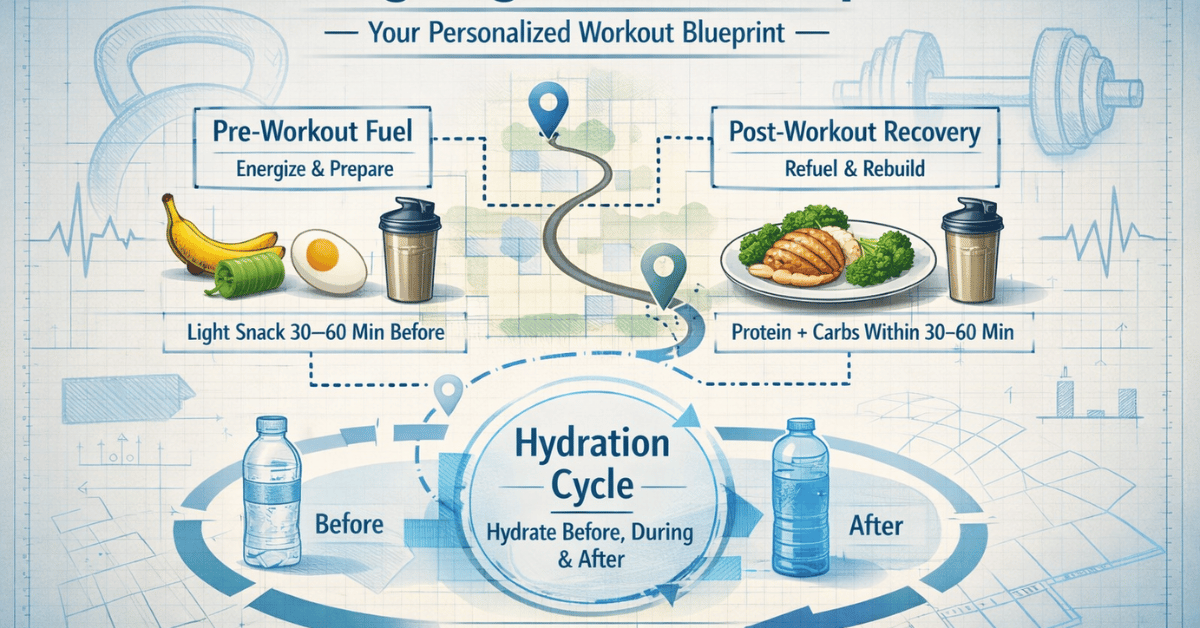
- Balance Challenge with Recovery: Every increase needs recovery. Hydrate, stretch, and prioritize protein intake to support adaptation.
Note
- Cauê V. La Scala Teixeira et al., “Complexity: A Novel Load Progression Strategy in Strength Training,” Frontiers in Physiology 10 (July 2019): 839, https://doi.org/10.3389/fphys.2019.00839. ↩︎