
Day 82 of 100 Days Coding Challenge: Python
Today’s quest was to give my civilizations a home on the globe. The idea was simple: accept the centroid latitude and longitude so I could finally see where each empire sat. Yesterday’s Poetry setup was already in place, so I dove straight into app/models/civilization.py and added two nullable float columns. Import section checked—no duplicates this time (lesson learned from yesterday’s chaos).
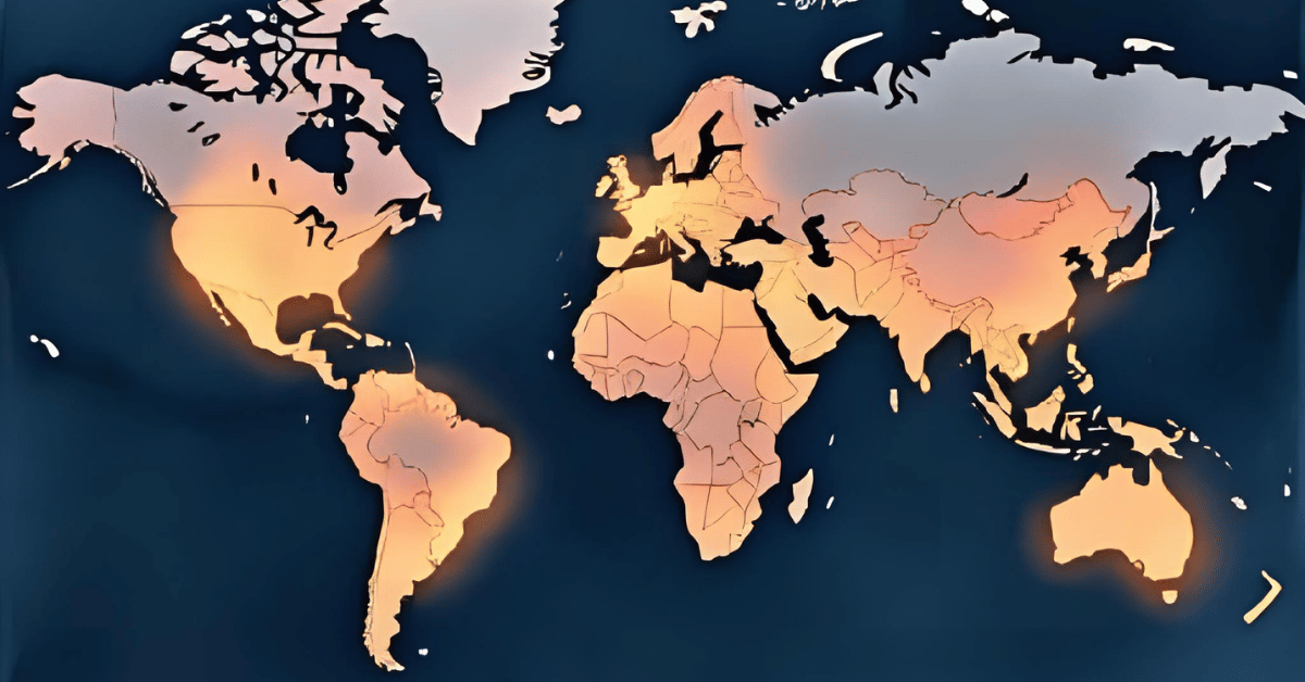
After migrating the database, I seeded some coordinates via a shiny new CSV file in data/seeds/civ_centroids. I even wrote a quick one-off script to update rows by slug. Feeling clever, I turned to streamlit_app.py, wiring it to fetch centroids and display them in the Civilization view. The beauty here? Both the timeline and map shared the same filters, so when I adjusted one, the other politely followed along.
Everything looked great—until I noticed two glaring absences. Rome and Sumer were missing, as if they’d been conquered all over again. The culprit? My seed data. Apparently, I’d named one “Rome” instead of “Roman,” and completely skipped Sumer. Maps don’t forgive typos, but at least the debugging process made me laugh instead of cry.
Today’s Motivation / Challenge
Maps are where timelines come to life. You can talk all day about Rome ,stretching from 509 BCE to 476 CE, but seeing it light up on a globe makes it real. Adding centroids is like putting pins on a giant corkboard of history—suddenly you’re not just reading about civilizations, you’re traveling to them.
Purpose of the Code (Object)
The code links civilizations to a pair of coordinates and plots them on a map. Each civilization becomes a marker you can hover over to see details. The magic lies in syncing the map with the timeline filters—change the years or regions, and both the chart and the map update in unison. It’s like history’s own GPS.
AI Prompt
Today, I would like to do the following:
- Add centroid latitude/longitude for each civilization.
- Plot them as markers with Plotly.
- Accept: changing filters updates both the timeline and the map consistently; hover shows useful info.
Functions & Features
- Add latitude and longitude columns to civilization records.
- Plot civilizations on an interactive map with Plotly.
- Hover over markers to reveal civilization details.
- Sync map and timeline filters for a seamless view.
Requirements / Setup
You’ll need:
- Python 3.11
Installs:
pip install plotly streamlit
Minimal Code Sample
fig = px.scatter_geo(
data_frame=items,
lat=”lat”,
lon=”lon”,
text=”name”
)
st.plotly_chart(fig, use_container_width=True)
Each civilization gets a marker on the map; hover reveals its name.
The Civilization Timeline Builder
Notes / Lessons Learned
So, what exactly went wrong? My CSV file was missing Sumer entirely, and instead of “Roman,” I had typed “Rome.” The app wasn’t confused—it was just being literal. Civilization slugs don’t do nicknames.
The funny part is that I was meticulously following the process, confident that everything was fine. It wasn’t until I noticed a strangely empty Mediterranean that I realized something was off. Double-checking with the API showed the slug as “roman,” which didn’t match my sloppy CSV entry.
In the end, nothing was wrong with the Python script at all—the bug was in my data. A good reminder that sometimes the problem isn’t your code, it’s the breadcrumbs you fed it. All told, it took about 1.75 hours, but now every civilization is exactly where it belongs.
Optional Ideas for Expansion
- Add pop-up info windows with key facts (years, tags, a fun trivia line).
- Layer in event markers so battles and inventions appear on the map too.
- Color-code civilizations by region for instant visual grouping.