
Day 89 of 100 Days Coding Challenge: Python
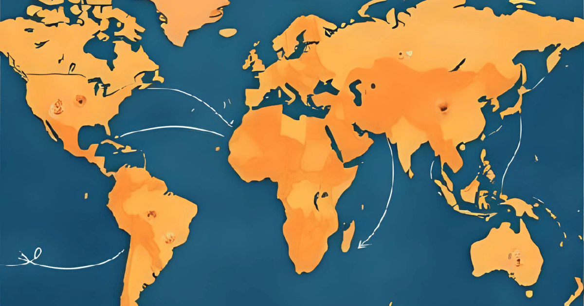
Today I gave my app a new toy: Tech Diffusion (beta). This feature traces how a chosen technology or theme spread from one civilization to another. It builds a mini-timeline of “first appearances” and plots arrows on a map showing the likely diffusion paths. It’s basically gossip for inventions—who did it first, and who copied whom.
I tested it with ironworking, fully expecting to see a neat west-to-east progression from the Middle East to Asia. Instead, I was surprised. Rome and Han China both show ironworking popping up around the same time, while the Gupta Empire only catches on centuries later. The Silk Road could explain part of this, but it still made me pause. Either the tech sprinted faster than my app shows—or my data has some catching up to do. Either way, it’s a reminder: history doesn’t always follow the tidy arrows we imagine.
Today’s Motivation / Challenge
Why does this matter? Because inventions don’t just happen—they move. From ironworking to paper to gunpowder, tracking how ideas spread reveals the hidden highways of human history. It’s the connective tissue between civilizations, proof that even ancient cultures were networked (without Wi-Fi, no less).
Purpose of the Code (Object)
The code identifies the earliest events tagged with a given theme, orders them on a timeline, and draws map arrows from early adopters to later ones. With it, you can watch technology hopscotch across regions, showing not only who led the way but also who eventually caught on. It’s a way to visualize cultural diffusion, not just in theory but in clickable, colorful practice.
AI Prompt
Please add the following function:
Tech diffusion
- For tag “ironworking” (example), show first appearances → later adoptions timeline & map arrows.
Functions & Features
- Search events by theme (e.g., “ironworking,” “Christianity”).
- Identify earliest appearances for each civilization.
- Plot a timeline ordered by first adopters.
- Draw arrows on a map to suggest diffusion paths.
Requirements / Setup
You’ll need:
- Python 3.11
Installs:
pip install streamlit plotly
Minimal Code Sample
events = [e for e in all_events if “ironworking” in e.tags]
events.sort(key=lambda e: e.year)
for i in range(1, len(events)):
fig.add_annotation(
x=events[i].lon, y=events[i].lat,
ax=events[i-1].lon, ay=events[i-1].lat,
arrowhead=2, showarrow=True
)
Orders events by year, then draws arrows between earlier and later adopters.
The Civilization Timeline Builder
Notes / Lessons Learned
The build went smoothly—until testing. When I searched for Christianity, everything worked: Rome’s Edict of Milan showed up, and Aksum’s adoption of Christianity appeared right where it belonged. But when I tested ironworking, nothing showed. After a few puzzled minutes, I discovered the culprit: my seed data. Rome and Han had tags with “ironworking,” but Gupta’s event was missing the tag altogether. No data, no arrows.
It reminded me of earlier struggles mapping civilizations—if the data isn’t there, no amount of clever code will conjure it. After correcting my CSV and reseeding, the function worked perfectly. Lesson learned: the best code still depends on the quality of the story you feed it.
Optional Ideas for Expansion
- Add multiple themes at once (e.g., track ironworking and horse domestication).
- Let users toggle arrow thickness by time delay (longer gaps = thinner arrows).
- Animate the diffusion so technologies appear and spread in real time.