Day 86 of 100 Days Coding Challenge: Python
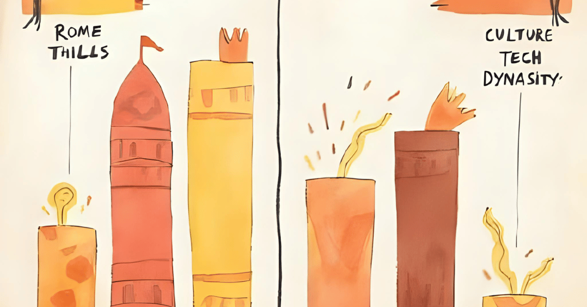
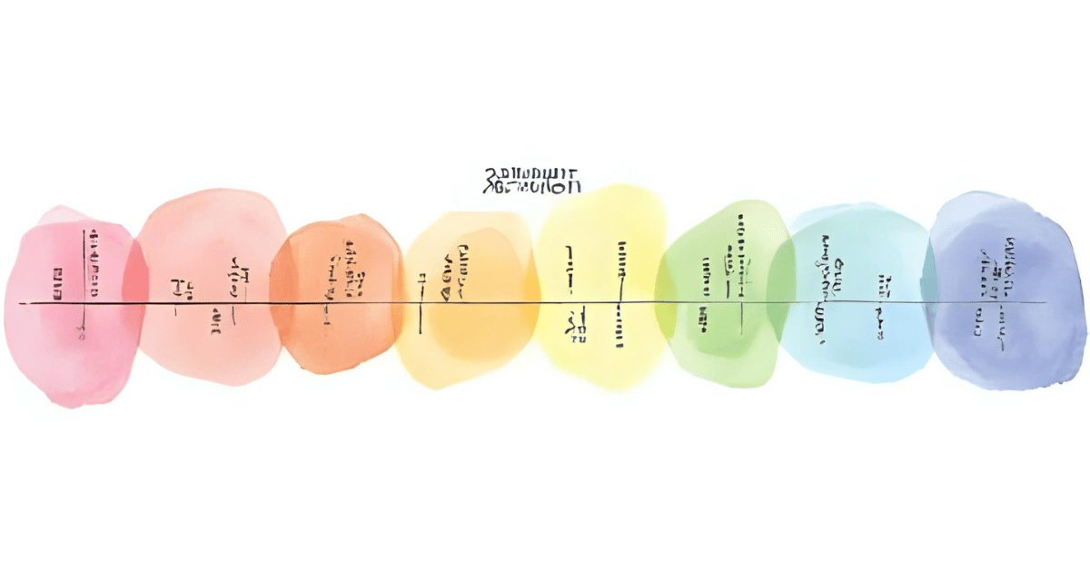
Yesterday was all about comparison charts—lining up civilizations side by side like contestants in a talent show. Today, I wanted to add a little sparkle. Literally. I built a new visualization called Hotspots by Century that highlights when and where civilizations were buzzing with activity.
The setup is simple: you filter the timeline by tags—say, “tech” or “culture”—and golden sparks light up the centuries with the highest density of events. These are the fireworks of history, the moments when civilizations hit their stride. It’s a surprisingly powerful way to spot peaks: think Athens in the 5th century BCE, or Tang China lighting up the cultural stage. That’s exactly what I wanted this feature for—revealing not just the “when” and “where,” but the “wow.”
Today’s Motivation / Challenge
History often feels flat when you just read dates in a list. But what if you could see when a region was absolutely popping off with events compared to its quieter neighbors? Hotspots give you that “heat map” feeling. It’s like scanning through Spotify charts—you know instantly which century was trending.
Purpose of the Code (Object)
The code measures how many events happen per century, then flags the busiest ones (top 20%). It plots golden markers or sparklines to make those peak periods stand out visually. By syncing with the same filters you’ve already been using, it stays consistent: adjust years, tags, or regions, and the hotspot chart updates instantly.
AI Prompt
Please add the following functions:
Day 11 — Hotspot detection
- Event density per century
- Sparkline per region
Accept: centuries with top quintile density highlighted
Functions & Features
- Count events per century across selected filters.
- Highlight the top 20% centuries as hotspots.
- Display sparklines per region to show peaks and valleys.
- Integrate seamlessly with existing filters (year, region, tag).
Requirements / Setup
You’ll need:
- Python 3.11
Installs:
pip install plotly streamlit
Minimal Code Sample
century_counts = df.groupby(“century”).size()
threshold = century_counts.quantile(0.8)
hotspots = century_counts[century_counts >= threshold]
fig = px.line(century_counts, x=century_counts.index, y=century_counts.values)
fig.add_scatter(x=hotspots.index, y=hotspots.values, mode=”markers”, marker=dict(color=”gold”))
Counts events by century, then highlights the busiest ones with golden markers.
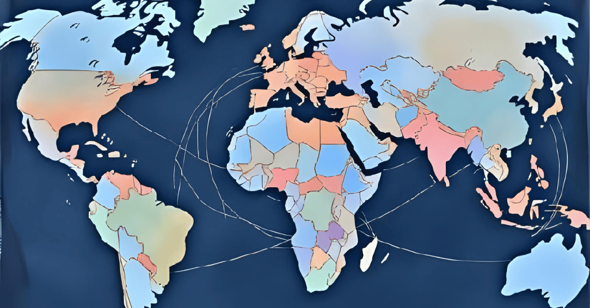
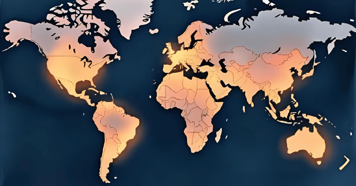
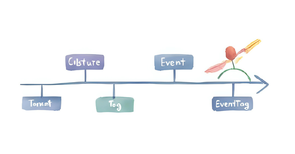
The Civilization Timeline Builder
Notes / Lessons Learned
I started by writing a helper to calculate where the sparks should go based on filters. Then came the delicate surgery: inserting this block between the map and the grid cards in my list view. One misplaced line, and the whole app could have gone dark. Fortunately, I’ve been careful about labeling my code, so the insertion went smoothly.
Compared to yesterday’s compare-page chaos, today felt easy. I opened Streamlit, played with year ranges, regions, and tags, and the hotspots shimmered exactly where they should. The best part? All the older functions stayed intact. Nothing broke. That’s always worth a small victory dance.
Optional Ideas for Expansion
- Add tooltips showing which events made a century “hot.”
- Animate the sparklines so hotspots flicker like real sparks.
- Allow users to adjust the “top percentage” (e.g., 10%, 25%) to fine-tune the view.