Historical Narrative Generator with One Click

Day 90 of 100 Days Coding Challenge: Python

Today I set out to give my app a voice of its own. The mission: generate a short 200–300-word historical narrative generator for whatever filters I’ve chosen. Basically, I wanted my app to play historian, skimming the top events and spitting out a digestible report. To do this, I turned to the trusty textwrap library.

Now, textwrap doesn’t sound glamorous—it’s no flashing map or animated arrow—but it does something crucial: it formats and wraps text so it looks neat and tidy. Think of it as the digital equivalent of that English teacher who insisted your essays had to fit on one page, double-spaced, 12-point font. Without it, you end up with messy, runaway text blocks. With it, you get something polished enough to pass off as a summary, a report, or maybe even a history newsletter.

It felt oddly satisfying—like giving the app its own narrator.

Today’s Motivation / Challenge

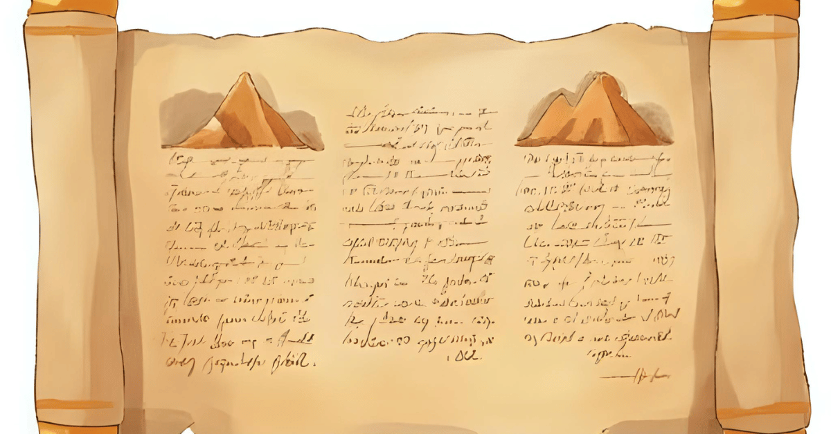
Why does this matter? Because clicking through endless events is like reading footnotes without the main text. A historical narrative generator summarizes a historical event and gives you the big picture: what happened, where it mattered, and why you should care. It’s like the “Previously on…” segment at the start of a TV show—except the show is about Mesopotamia instead of crime dramas.

Purpose of the Code (Object)

The code pulls the most important events from the current filter and stitches them into a compact narrative. It uses textwrap to make the summary readable and presentable. The end result is a neat little block of text you can generate with a button click, then edit as you see fit.

AI Prompt

We would like to add:
Narrative summary (extractive)

  • Generate 200–300-word summary for current filter (extract top events).
  • Accept: button produces summary; editable text area.

Functions & Features

  • Extract top events from the current filter.
  • Auto-generate a narrative summary (200–300 words).
  • Display the summary in an editable text box for user tweaks.
  • Format the text neatly with textwrap.

Requirements / Setup

You’ll need:

  • Python 3.11

Installs:

pip install textwrap3 streamlit

Minimal Code Sample

import textwrap

summary = ” “.join([e.description for e in top_events])

wrapped = textwrap.fill(summary, width=80)

st.text_area(“Generated Summary”, value=wrapped, height=200)

Collects event descriptions, wraps the text neatly, and displays it for editing.

The Civilization Timeline Builder

Notes / Lessons Learned

After wiring up the function, I thought everything was ready—until I realized my civilization details had disappeared. Worse, the shiny new “Generate Summary” button was missing too. The culprit? Code order. My narrative block had slipped into the wrong conditional, pairing itself with the diffusion toggle instead of the list/detail switch.

So when diffusion was off, the else: block tried to show a nonexistent detail view, and the summary button went into hiding. Once I moved everything back under the right branch, the details returned, and my summary button reappeared like a magician pulling a rabbit from a hat.

Lesson learned: order matters. Functions can’t just float wherever they want—think of them like stubborn cats. If you put them in the wrong room, they’ll refuse to come out until you move them properly.

Optional Ideas for Expansion

  • Add a “copy to clipboard” button for easy sharing.
  • Export summaries as a text or PDF file.
  • Let users choose between a short, medium, or long summary length.

Tech Diffusion — Tracing How Innovations Spread Across Civilizations

Day 89 of 100 Days Coding Challenge: Python

Today I gave my app a new toy: Tech Diffusion (beta). This feature traces how a chosen technology or theme spread from one civilization to another. It builds a mini-timeline of “first appearances” and plots arrows on a map showing the likely diffusion paths. It’s basically gossip for inventions—who did it first, and who copied whom.

I tested it with ironworking, fully expecting to see a neat west-to-east progression from the Middle East to Asia. Instead, I was surprised. Rome and Han China both show ironworking popping up around the same time, while the Gupta Empire only catches on centuries later. The Silk Road could explain part of this, but it still made me pause. Either the tech sprinted faster than my app shows—or my data has some catching up to do. Either way, it’s a reminder: history doesn’t always follow the tidy arrows we imagine.

Today’s Motivation / Challenge

Why does this matter? Because inventions don’t just happen—they move. From ironworking to paper to gunpowder, tracking how ideas spread reveals the hidden highways of human history. It’s the connective tissue between civilizations, proof that even ancient cultures were networked (without Wi-Fi, no less).

Purpose of the Code (Object)

The code identifies the earliest events tagged with a given theme, orders them on a timeline, and draws map arrows from early adopters to later ones. With it, you can watch technology hopscotch across regions, showing not only who led the way but also who eventually caught on. It’s a way to visualize cultural diffusion, not just in theory but in clickable, colorful practice.

AI Prompt

Please add the following function:
Tech diffusion

  • For tag “ironworking” (example), show first appearances → later adoptions timeline & map arrows.

Functions & Features

  • Search events by theme (e.g., “ironworking,” “Christianity”).
  • Identify earliest appearances for each civilization.
  • Plot a timeline ordered by first adopters.
  • Draw arrows on a map to suggest diffusion paths.

Requirements / Setup

You’ll need:

  • Python 3.11

Installs:

pip install streamlit plotly

Minimal Code Sample

events = [e for e in all_events if “ironworking” in e.tags]

events.sort(key=lambda e: e.year)

for i in range(1, len(events)):

    fig.add_annotation(

        x=events[i].lon, y=events[i].lat,

        ax=events[i-1].lon, ay=events[i-1].lat,

        arrowhead=2, showarrow=True

    )

Orders events by year, then draws arrows between earlier and later adopters.

The Civilization Timeline Builder

Notes / Lessons Learned

The build went smoothly—until testing. When I searched for Christianity, everything worked: Rome’s Edict of Milan showed up, and Aksum’s adoption of Christianity appeared right where it belonged. But when I tested ironworking, nothing showed. After a few puzzled minutes, I discovered the culprit: my seed data. Rome and Han had tags with “ironworking,” but Gupta’s event was missing the tag altogether. No data, no arrows.

It reminded me of earlier struggles mapping civilizations—if the data isn’t there, no amount of clever code will conjure it. After correcting my CSV and reseeding, the function worked perfectly. Lesson learned: the best code still depends on the quality of the story you feed it.

Optional Ideas for Expansion

  • Add multiple themes at once (e.g., track ironworking and horse domestication).
  • Let users toggle arrow thickness by time delay (longer gaps = thinner arrows).
  • Animate the diffusion so technologies appear and spread in real time.

Sequence Hints in Streamlit: Find Neighbor Events Within ±50 Years

Day 88 of 100 Days Coding Challenge: Python

Today, I rolled out an experimental function for my civilization app—something I’ve never attempted before. The idea? Track what’s happening in neighboring civilizations within ±50 years of a major event. The goal isn’t to claim causation, but to look for ripples because history loves ripples.

Take Rome, for example. If you see a burst of military aggression from nearby empires around the same time Rome is wobbling, you can start to piece together the larger story. And it doesn’t stop at politics or warfare. Cultural and technological shifts—like paper-making or gunpowder—also spread from neighbor to neighbor, changing the trajectory of civilizations in ways subtle and spectacular.

Honestly, I was pretty excited to build this. It feels like uncovering the “behind-the-scenes” footage of history, where you see not just what happened but what was happening in the background.

Today’s Motivation / Challenge

Why does this matter? Because no civilization exists in isolation. Every rise or fall has echoes in neighboring regions. Whether it’s Rome watching the Huns thunder in, or India passing along the concept of zero, the world is full of crossovers. By tracking those overlaps, we get a richer picture of history’s interconnected web—basically, the original shared universe.

Purpose of the Code (Object)

The code adds a “sequence hints” feature that scans for major neighbor changes within ±50 years of a civilization’s events. The results are shown as a neat badge with tooltips, so you can quickly see counts and peek at details. It’s not claiming “X caused Y,” but it highlights when civilizations were moving in sync—or clashing in spectacular ways.

AI Prompt

Please add this function:
Day 13 — Sequence hints

  • For each civ, list major neighbor changes within ±50 years (label “sequence, not causation”).
  • Accept: UI badge shows counts; tooltip text is clear.

Functions & Features

  • Scan for significant neighbor events within ±50 years.
  • Display overlaps as badges with event counts.
  • Provide tooltips with details like event type, year, and time delta.
  • Sync with the same filters (region, tags, years).

Requirements / Setup

You’ll need:

  • Python 3.11

Installs:

pip install streamlit plotly

Minimal Code Sample

def sequence_hints(civ, all_civs):

    hints = []

    for neighbor in all_civs:

        if neighbor.id == civ.id: 

            continue

        for event in neighbor.events:

            if abs(event.year – civ.year) <= 50:

                hints.append((neighbor.name, event))

    return hints

Checks if a neighbor’s event happened within ±50 years and records it.

The Civilization Timeline Builder

Notes / Lessons Learned

The feature turned out to be fascinating in practice. I tested it with the Roman Republic, focusing on 0–400 CE, and the results popped:

  • Gupta Empire
    400: Decimal & Zero · tech · Δ5 yrs
    415: Iron Pillar of Delhi · tech · Δ20 yrs
    500: Decline Under Huns · war · Δ24 yrs
  • Kingdom of Aksum
    330: Adopts Christianity · religion · Δ17 yrs

Not exactly the sweeping revelations I imagined, but enough to prove the concept. The catch? I only uploaded 12 civilizations so far. To make this function shine, I’ll need a much larger dataset.

Lesson of the day: even pilot versions can teach you a lot, but history—like data science—works best with more data points.

Optional Ideas for Expansion

  • Add filters to focus on specific event types (e.g., only tech overlaps).
  • Visualize the overlaps on the map with arrows or connectors.
  • Show a timeline side-by-side view to compare ripple effects across civilizations.

 Save Filter Presets — Add Theme Lenses to Your History App

Day 87 of 100 Days Coding Challenge: Python

Because I have another commitment tomorrow, I decided to sneak today’s function into the schedule a little early. The feature of the day? Saving filters. Think of it as adding a “save game” button to history. If you’ve ever played a Nintendo game that didn’t let you save, you know the pain—hours of progress gone because your little brother unplugged the console. I didn’t want my carefully chosen filters to vanish the same way.

Of course, no feature comes without a little drama. I hit two big issues. Back when I started coding, any red error message would send me into full panic mode. Now, I’ve learned that most problems are just puzzles with bad timing. Today reminded me of that: slow down, breathe, and fix one thing at a time.

Today’s Motivation / Challenge

Why does this matter? Because sometimes you don’t want to rebuild the same filter every time you open the app. Imagine crafting the perfect view of “iron adoption in Eurasia, 800 BCE–200 CE,” then losing it forever because you clicked away. Saving presets means you can revisit your favorite “lenses” with one click, whether it’s maritime trade routes or technological revolutions.

Purpose of the Code (Object)

The code lets you save your current filter selections as JSON presets—called “theme lenses.” You can load, switch, and reuse them later. This way, your app remembers what you care about, and you can jump straight into exploring without re-selecting everything.

AI Prompt

Please add the following functions:
Theme lenses

  • Save filter presets (JSON): “maritime trade”, “iron adoption”, etc.

Accept: load/switch lenses in 1 click

Functions & Features

  • Save current filter selections as named JSON files.
  • Load a saved filter (“lens”) instantly with one click.
  • Keep taxonomy tags (like “tech” or “war”) consistent, even if not in the current tag list.

Requirements / Setup

You’ll need:

  • Python 3.11

Installs:

pip install streamlit

Minimal Code Sample

def save_lens(name, filters):

    with open(f”lenses/{name}.json”, “w”) as f:

        json.dump(filters, f)

def load_lens(name):

    with open(f”lenses/{name}.json”) as f:

        return json.load(f)

One function saves filters as JSON; the other loads them back into the app.

The Civilization Timeline Builder

Notes / Lessons Learned

The first bug was almost comical: I forgot to delete the existing sidebar widget, so suddenly I had two period selectors glaring at me. That one was an easy fix. The trickier problem was when lenses like “maritime trade” or “iron adoption” triggered Streamlit errors. The issue? I had assigned values that didn’t exist in the current all_tags list. Streamlit doesn’t like when you ask for something it doesn’t offer.

The solution was to create a script that merges the database-derived options with whatever free-form values the lens needed. That way, even if the lens specifies tags like “sea” or “tech,” it still works, whether or not those appear in all_tags. After some careful debugging, everything finally clicked into place.

The real lesson: don’t try to fix every error at once. Solve one, breathe, then tackle the next. The process is a lot less stressful that way.

Optional Ideas for Expansion

  • Add a dropdown of saved lenses in the sidebar for quick access.
  • Allow exporting and sharing lenses with friends (history study group, anyone?).
  • Include a “random lens” button for surprise explorations.

How to Spot History’s Most Active Centuries with Hotspot Charts

Day 86 of 100 Days Coding Challenge: Python

Yesterday was all about comparison charts—lining up civilizations side by side like contestants in a talent show. Today, I wanted to add a little sparkle. Literally. I built a new visualization called Hotspots by Century that highlights when and where civilizations were buzzing with activity.

The setup is simple: you filter the timeline by tags—say, “tech” or “culture”—and golden sparks light up the centuries with the highest density of events. These are the fireworks of history, the moments when civilizations hit their stride. It’s a surprisingly powerful way to spot peaks: think Athens in the 5th century BCE, or Tang China lighting up the cultural stage. That’s exactly what I wanted this feature for—revealing not just the “when” and “where,” but the “wow.”

Today’s Motivation / Challenge

History often feels flat when you just read dates in a list. But what if you could see when a region was absolutely popping off with events compared to its quieter neighbors? Hotspots give you that “heat map” feeling. It’s like scanning through Spotify charts—you know instantly which century was trending.

Purpose of the Code (Object)

The code measures how many events happen per century, then flags the busiest ones (top 20%). It plots golden markers or sparklines to make those peak periods stand out visually. By syncing with the same filters you’ve already been using, it stays consistent: adjust years, tags, or regions, and the hotspot chart updates instantly.

AI Prompt

Please add the following functions:
Day 11 — Hotspot detection

  • Event density per century
  • Sparkline per region

Accept: centuries with top quintile density highlighted

Functions & Features

  • Count events per century across selected filters.
  • Highlight the top 20% centuries as hotspots.
  • Display sparklines per region to show peaks and valleys.
  • Integrate seamlessly with existing filters (year, region, tag).

Requirements / Setup

You’ll need:

  • Python 3.11

Installs:

pip install plotly streamlit

Minimal Code Sample

century_counts = df.groupby(“century”).size()

threshold = century_counts.quantile(0.8)

hotspots = century_counts[century_counts >= threshold]

fig = px.line(century_counts, x=century_counts.index, y=century_counts.values)

fig.add_scatter(x=hotspots.index, y=hotspots.values, mode=”markers”, marker=dict(color=”gold”))

Counts events by century, then highlights the busiest ones with golden markers.

The Civilization Timeline Builder

Notes / Lessons Learned

I started by writing a helper to calculate where the sparks should go based on filters. Then came the delicate surgery: inserting this block between the map and the grid cards in my list view. One misplaced line, and the whole app could have gone dark. Fortunately, I’ve been careful about labeling my code, so the insertion went smoothly.

Compared to yesterday’s compare-page chaos, today felt easy. I opened Streamlit, played with year ranges, regions, and tags, and the hotspots shimmered exactly where they should. The best part? All the older functions stayed intact. Nothing broke. That’s always worth a small victory dance.

Optional Ideas for Expansion

  • Add tooltips showing which events made a century “hot.”
  • Animate the sparklines so hotspots flicker like real sparks.
  • Allow users to adjust the “top percentage” (e.g., 10%, 25%) to fine-tune the view.

Rome vs. Han: Building a Civilization Comparison Chart in Streamlit

Day 85 of 100 Days Coding Challenge: Python

I used to play a lot of strategy games, the kind where you spend three hours carefully planning your empire, only to have it crushed in ten minutes by a neighbor with more horses. Games like that teach you to watch how civilizations grow, stagnate, or collapse. You can almost predict who’s about to get steamrolled just by comparing their stats.

History works much the same way. Put two civilizations side by side—say, Rome and Han China—and you suddenly see why their stories diverged. Rome spent half its time fending off invasions, while the Han perfected bureaucracy. Compare Rome with the Maya, and the differences are even starker: isolation breeds innovation, but it also cuts you off from trade (and from borrowing your neighbor’s better swords).

Today’s goal was to bring a little of that strategy-game flavor into the app: a simple two-column comparison page. Nothing fancy yet—just counts of notable events and a basic stacked chart. It’s like the “stats screen” in a game, only with fewer armies marching across your screen.

Today’s Motivation / Challenge

Why does this matter? Because looking at a single civilization is like reading only one diary entry—you need another perspective to see the bigger picture. Comparing two side by side makes it obvious who was busy inventing paper, who was busy conquering Gaul, and who probably should’ve spent less time building statues.

Purpose of the Code (Object)

The code creates a comparison page where you pick two civilizations and view their stats side by side. It counts events, groups them by type, and renders a stacked bar chart to visualize differences. The point isn’t to crown a winner—it’s to highlight how geography, culture, and timing shaped civilizations in very different ways.

AI Prompt

Please add the following function:
Two-column compare page with stats + stacked event-type chart.
✅ Accept: Rome vs Han page loads with counts & charts.

Functions & Features

  • Two-column layout: each civilization gets its own stats.
  • Count and display events by type (war, dynasty, tech, etc.).
  • Render a stacked bar chart comparing event types.
  • Default comparison: Roman Empire vs. Han Dynasty.

Requirements / Setup

You’ll need:

  • Python 3.11

Installs:

pip install streamlit plotly

Minimal Code Sample

col1, col2 = st.columns(2)

for civ, col in zip([civ1, civ2], [col1, col2]):

    counts = count_events(civ)

    col.metric(“Total Events”, sum(counts.values()))

    fig = px.bar(x=list(counts.keys()), y=list(counts.values()), title=civ.name)

    col.plotly_chart(fig, use_container_width=True)

Each column shows event counts and a stacked bar chart for one civilization.

The Civilization Timeline Builder

Notes / Lessons Learned

Today I started by adding helpers: one to count event types for a civilization, another to build the comparison charts. The key was a simple checkbox that flips the app into “comparison mode.” Once checked, it renders two columns side by side with statistics and charts.

The defaults were Rome and Han, because if you’re going to compare civilizations, why not start with the classics? After some tweaking with tags, regions, and year ranges, everything fell into place. The best part? Watching the charts reveal subtle differences—Rome with its wars, Han with its bureaucratic cycles—like two old rivals showing off their report cards.

Optional Ideas for Expansion

  • Add a “random matchup” button (Maya vs. Vikings? Why not).
  • Include percentage comparisons (e.g., 40% wars vs. 10% tech).
  • Allow exporting comparison results as a snapshot image for presentations or study notes.

I Built a Civilization Overlap Detection Graph in My Timeline App

Day 84 of 100 Days Coding Challenge: Python

Today I taught my app a new trick: showing which civilizations overlapped in time. Now, when you open a civilization’s detail page, you not only get its story, but also a handy list of its “neighbors” and even a small network graph that shows how timelines intersect.

Why bother? Because civilizations rarely lived in a vacuum. They bumped into each other constantly—sometimes trading spices and inventions, other times trading insults and spears. Think about paper or gunpowder leaving China and changing the world, or the ripple effect of Rome’s conversion to Christianity. Overlaps tell us who was around to witness (or resist) those changes. It’s a reminder that history is less about isolated silos and more about crowded dinner tables where everyone argues over who invented noodles first.

Today’s Motivation / Challenge

Looking at a single civilization is fine, but history really comes alive when you see what else was happening at the same time. Were they sharing trade routes? Fighting over borders? Borrowing each other’s gods and gadgets? By showing overlaps, the app gives us a quick peek into those messy, fascinating interactions. It’s like flipping to the “crossovers” episode in your favorite TV universe.

Purpose of the Code (Object)

The code checks which civilizations were active during the same time period. If their timelines overlap, it records the connection. On the detail page, these overlaps are displayed as a list of neighbors and a small graph where nodes are civilizations and edges are overlaps. Pick any two civilizations, and you’ll know instantly whether they were contemporaries—or whether one was long gone before the other showed up.

AI Prompt

I want to add the following functions:

  • Compute overlaps between civilizations.
  • Show the list of neighbors on the civ detail page.
  • Add a small network graph of overlapping civilizations.
  • Accept: picking any two civilizations and showing overlap or no overlap.

Functions & Features

  • Calculate whether two civilizations’ date ranges overlap.
  • Display a list of overlapping civilizations on the detail page.
  • Render a simple network graph showing connections.
  • Keep filters (years, tags, regions) consistent across both timeline and overlap view.

Requirements / Setup

You’ll need:

  • Python 3.11

Installs:

pip install plotly networkx

Minimal Code Sample

def overlaps(civ1, civ2):

    return civ1.start_year <= civ2.end_year and civ2.start_year <= civ1.end_year

neighbors = [c for c in all_civs if overlaps(civ, c) and c.id != civ.id]

This simple function checks if two civilizations’ timelines overlap.

The Civilization Timeline Builder

Notes / Lessons Learned

At first, I thought everything was smooth. Then I ran Poetry, and poof—my event dots vanished from the sidebar. The culprit? I’d placed the event-dots block outside _build_timeline_bands(…). Order matters, and mine was a mess. It reminded me of my first brush with Visual Basic decades ago, when I was scolded endlessly about naming conventions and comments. Turns out, old habits save you: my comments helped me track down the rogue block quickly.

Another wrinkle: filtering by a single tag caused some civilizations to disappear entirely. The fix was adding conds.append(or_(*preds)) so the query could handle multiple possibilities gracefully. That way, selecting “tech” doesn’t mean losing all the civilizations that had tech and culture in the same event.

After some code shuffling, a rerun, and a sigh of relief, everything worked: overlapping civilizations lit up both as lists and in the graph, while event dots stayed loyally in place.

Optional Ideas for Expansion

  • Add hover tooltips in the network graph with details like duration of overlap.
  • Weight the graph edges by the length of overlap (longer overlaps = thicker lines).
  • Let users toggle “overlap mode” to see only civilizations that shared at least 100 years.

How I Color-Coded Historical Events in My Timeline Builder

Day 83 of 100 Days Coding Challenge: Python

I’ve loved history for as long as I can remember. By fourth grade, I was devouring children’s versions of The Histories by Herodotus while other kids were still stuck on Goosebumps. My parents’ library was my playground, and I spent hours flipping through volumes that smelled faintly of dust and mystery. By the time school took history seriously in high school, I was already knee-deep in maps and timelines.

Back then, I didn’t know the word “mind mapping,” but that’s essentially what I was doing. I’d draw crude maps, sketch arrows, and connect civilizations like I was building my own analog version of Wikipedia. Today’s task reminded me of that hobby: giving my timeline builder a taxonomy of event kinds—wars, dynasties, tech, culture, economy, religion—so that I can glance at a timeline and instantly know what kind of drama unfolded. Think of it as giving history not just a shape, but also a color palette.

Today’s Motivation / Challenge

Why bother with taxonomies? Because not all events are created equal. A war feels very different from an invention, and a dynasty change isn’t the same as a religious reform. By categorizing events and slapping on colors and icons, the app becomes more than a list of “things that happened.” It becomes a visual storybook where you can spot patterns at a glance—wars clustering together, bursts of culture, or dynasties toppling like dominoes.

Purpose of the Code (Object)

The code assigns each event a category (“kind”) and gives it a color and icon. When you view a civilization’s timeline, events appear as dots along its bar, each colored by type. A neat legend ties it all together, letting you see not just when things happened, but what kind of things they were. It’s like adding subtitles to history.

AI Prompt

Today is the day 8 of this project. Please add the following script:
Day 8 — Event types & icons

  • Kind taxonomy (war/dynasty/tech/culture/economy/religion).
  • Accept: legend renders; event dots color by kind.

Functions & Features

  • Define taxonomy of event types (war, dynasty, tech, culture, economy, religion, other).
  • Assign each taxonomy a color and icon for clarity.
  • Display event dots along timeline bars, grouped and color-coded by type.
  • Add a clean legend so users know exactly what each dot means.

Requirements / Setup

You’ll need:

  • Python 3.11

Installs:

pip install plotly streamlit

Minimal Code Sample

KIND_COLORS = {

    “war”: “red”, “dynasty”: “blue”, “tech”: “green”,

    “culture”: “purple”, “economy”: “orange”, “religion”: “gold”

}

for kind, group in grouped_events.items():

    fig.add_scatter(

        x=group[“year”], y=group[“civ”],

        mode=”markers”, name=kind.capitalize(),

        marker=dict(color=KIND_COLORS.get(kind, “gray”))

    )

Each event type gets its own scatter trace with a color-coded legend.

The Civilization Timeline Builder

Notes / Lessons Learned

We started by defining the taxonomy—deciding which categories mattered most. I learned from yesterday’s naming mishap that consistency is everything, so I double-checked each description to keep it tidy. Each taxonomy got a color, and if an event didn’t fit, we just shoved it into “Other.” Practical and honest.

One fun surprise: Python 3.11’s str | None is cleaner than Optional[str], though you may see both depending on your version. Reddit was full of debates about this, but personally, I like the shorthand.

The real magic came when we modified the build_time_band function to group events by kind and add scatter traces only if there were points. That way, the legend didn’t become cluttered with empty categories. Now the timelines look like candy-colored storylines, dotted with wars, dynasties, and cultural sparks. The result? A clean legend across the top and timelines that actually feel alive.

Optional Ideas for Expansion

  • Add tiny event icons (like swords for wars or scrolls for culture) alongside the dots.
  • Let users filter the timeline by event kind (e.g., “Show me only tech”).
  • Stack events into mini-bands under each civ for an even clearer breakdown.

Mapping Civilizations with Plotly in the Timeline App

Day 82 of 100 Days Coding Challenge: Python

Today’s quest was to give my civilizations a home on the globe. The idea was simple: accept the centroid latitude and longitude so I could finally see where each empire sat. Yesterday’s Poetry setup was already in place, so I dove straight into app/models/civilization.py and added two nullable float columns. Import section checked—no duplicates this time (lesson learned from yesterday’s chaos).

After migrating the database, I seeded some coordinates via a shiny new CSV file in data/seeds/civ_centroids. I even wrote a quick one-off script to update rows by slug. Feeling clever, I turned to streamlit_app.py, wiring it to fetch centroids and display them in the Civilization view. The beauty here? Both the timeline and map shared the same filters, so when I adjusted one, the other politely followed along.

Everything looked great—until I noticed two glaring absences. Rome and Sumer were missing, as if they’d been conquered all over again. The culprit? My seed data. Apparently, I’d named one “Rome” instead of “Roman,” and completely skipped Sumer. Maps don’t forgive typos, but at least the debugging process made me laugh instead of cry.

Today’s Motivation / Challenge

Maps are where timelines come to life. You can talk all day about Rome ,stretching from 509 BCE to 476 CE, but seeing it light up on a globe makes it real. Adding centroids is like putting pins on a giant corkboard of history—suddenly you’re not just reading about civilizations, you’re traveling to them.

Purpose of the Code (Object)

The code links civilizations to a pair of coordinates and plots them on a map. Each civilization becomes a marker you can hover over to see details. The magic lies in syncing the map with the timeline filters—change the years or regions, and both the chart and the map update in unison. It’s like history’s own GPS.

AI Prompt

Today, I would like to do the following:

  • Add centroid latitude/longitude for each civilization.
  • Plot them as markers with Plotly.
  • Accept: changing filters updates both the timeline and the map consistently; hover shows useful info.

Functions & Features

  • Add latitude and longitude columns to civilization records.
  • Plot civilizations on an interactive map with Plotly.
  • Hover over markers to reveal civilization details.
  • Sync map and timeline filters for a seamless view.

Requirements / Setup

You’ll need:

  • Python 3.11

Installs:

pip install plotly streamlit

Minimal Code Sample

fig = px.scatter_geo(

    data_frame=items,

    lat=”lat”,

    lon=”lon”,

    text=”name”

)

st.plotly_chart(fig, use_container_width=True)

Each civilization gets a marker on the map; hover reveals its name.

The Civilization Timeline Builder

Notes / Lessons Learned

So, what exactly went wrong? My CSV file was missing Sumer entirely, and instead of “Roman,” I had typed “Rome.” The app wasn’t confused—it was just being literal. Civilization slugs don’t do nicknames.

The funny part is that I was meticulously following the process, confident that everything was fine. It wasn’t until I noticed a strangely empty Mediterranean that I realized something was off. Double-checking with the API showed the slug as “roman,” which didn’t match my sloppy CSV entry.

In the end, nothing was wrong with the Python script at all—the bug was in my data. A good reminder that sometimes the problem isn’t your code, it’s the breadcrumbs you fed it. All told, it took about 1.75 hours, but now every civilization is exactly where it belongs.

Optional Ideas for Expansion

  • Add pop-up info windows with key facts (years, tags, a fun trivia line).
  • Layer in event markers so battles and inventions appear on the map too.
  • Color-code civilizations by region for instant visual grouping.

Adding a Function to Visualize History with Plotly Timeline Bars

Day 81 of 100 Days Coding Challenge: Python

Today’s mission was to finally put some clothes on our bare-bones timeline—specifically, horizontal bars that show civilizations stretching across the years like colorful ribbons. Picture this: you pick a range of years in the sidebar, and voilà, a neat bar chart unfurls, each line representing a civilization strutting across history.

Ever since kicking off this Civilization Timeline project, I’ve been living in a constant state of “overwhelmed but learning.” Every day brings a new tool, a new library, or a new way to break my code. But at its core, it’s still Python—the same familiar friend in a slightly fancier suit.

The tricky part? Each new feature has to be inserted into just the right place. Add it too early, and it vanishes; too late, and it breaks everything. It’s like threading a needle in the dark: satisfying when it works, frustrating when it doesn’t.

Today’s Motivation / Challenge

Why add bars? Because walls of text are fine for a history book, but if you really want to see civilizations rise and fall, you need visuals. Bars turn abstract dates into something tangible. Instead of saying, “The Han Dynasty lasted four centuries,” you can see its line stretching across the timeline, rubbing shoulders with Rome. It’s like putting history on a conveyor belt and watching empires roll past.

Purpose of the Code (Object)

The code adds timeline bands—horizontal bars that show how long each civilization lasted within the years you’ve selected. You pick a date range, and the app maps the civilizations that overlap with it. Hover over a bar, and you’ll see its start and end dates. It’s history turned into a chart you can actually play with.

AI Prompt

Please add the following function to the existing script:
Day 6 — Timeline bands

  • Horizontal bars per civ within selected range (Plotly).
  • Accept: bars scale correctly; hover shows dates & duration.

Functions & Features

  • Draw horizontal timeline bars for civilizations in the selected year range.
  • Hover tooltips show start and end dates plus duration.
  • Single-civilization band on the detail page for close-up analysis.

Requirements / Setup

You’ll need:

  • Python 3.11

Installs:

pip install plotly

Minimal Code Sample

fig = px.timeline(

    x_start=[c[“start_year”] for c in items],

    x_end=[c[“end_year”] for c in items],

    y=[c[“name”] for c in items]

)

fig.update_yaxes(autorange=”reversed”)

st.plotly_chart(fig, use_container_width=True)

Each bar stretches across its start and end years—Plotly handles the drawing magic.

The Civilization Timeline Builder

Notes / Lessons Learned

The day began with installing Plotly, which immediately felt like unlocking a new superpower: interactive graphs! At first, I only wanted to create multi-civilization bars on the main page, but then I thought, “Why stop there?” So I snuck in a single-civ band on the detail page, too. Now, whenever you zoom in on one civilization, you get its own mini-timeline. Totally extra, but worth it.

The big lesson? Inserting new code is like assembling IKEA furniture. Put the shelf in the wrong slot and suddenly the whole bookcase wobbles. Place the band code in just the right spot, and everything stands tall.

Optional Ideas for Expansion

  • Add different colors for event types (wars, tech, culture) along the bars.
  • Let users toggle between BCE/CE and “absolute” year numbers.
  • Allow comparison mode where two civilizations’ bands overlap on the same detail page.